Music is more than sound, it’s emotion, identity, and culture. As someone who writes weekly about different genres, I’m always looking for ways to make music discovery more accessible and engaging. Infographics are perfect for this: they turn big ideas, industry stats, and genre breakdowns into visuals that stick.
This week, I’m analyzing two music infographics that do just that. One highlights the emotional power of music, and the other breaks down the top music genres across the U.S. and beyond. Whether you’re a casual listener or full-on music nerd, these visuals tell meaningful stories, and offer design inspiration for my own upcoming infographic project.
Infographic #1: The Power of Music – Musicnotes
📍 Link: View infographic details here
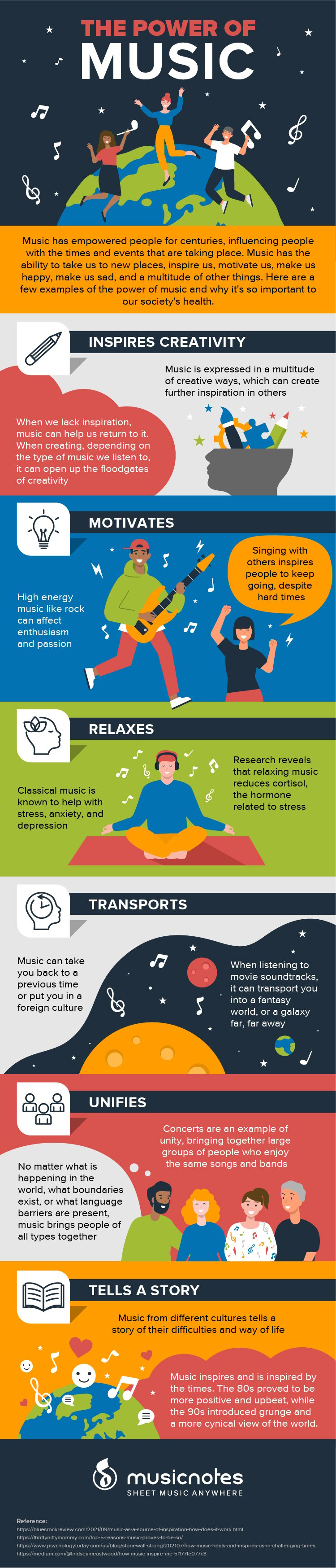
This infographic explores six key ways music impacts our lives: it inspires creativity, motivates, relaxes, transports, unifies, and tells a story. Instead of leaning on numbers, it leans into emotion, and that’s exactly why it works.
Why It’s Effective:
- Visual Hierarchy & Organization:
Each theme is sectioned clearly with bold headers, icons, and colorful illustrations. The flow is vertical and intuitive, taking the viewer through each benefit one at a time. - Color Choices:
The soft palette of purples, blues, oranges, and yellows creates a welcoming, optimistic vibe. Each section has a unique color tone, helping to distinguish ideas and set the mood. - Typography & Readability:
Clean sans-serif fonts and consistent sizing keep it modern and legible. Text is spaced out just enough to make reading easy without crowding the visuals. - Balance of Text and Visuals:
Each point includes a short description and an expressive illustration, perfectly balanced for scrolling or printing. No walls of text, just enough info to spark thought. - Telling a Story with Data:
While it doesn’t use hard stats, this infographic tells a universal story of how music connects us. It reminds us why music matters, which is the soul of my blog’s entire mission.
What I’ll Use in My Own Infographic:
- Icon-based visuals
- A calming, thematic color palette
- Short, impactful copy that pairs with visuals
Infographic #2: Don’t Stop the Music: A Look at America’s Favorite Genres – BeginnerGuitar.pro
📍 Link: Explore the infographic and full article
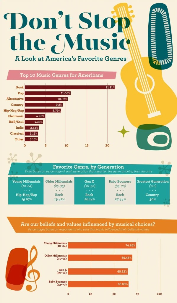
This infographic offers a breakdown of the top 10 most popular music genres worldwide, including genre descriptions, key instruments, notable time periods, and cultural origins.
Why It’s Effective:
- Visual Hierarchy & Organization:
The infographic is divided by genre, with each one getting its own space and section. Icons, titles, and supporting text are laid out in a clean vertical flow, making it easy to follow. - Color Choices:
Soft but bold colors are used to represent each genre, making it easy to distinguish reggae from rock or hip-hop from country. The colors help define mood and tone for each genre. - Typography & Readability:
Genre headers are large and bold, while body text remains small but readable. The clean contrast ensures that both casual skimming and deep reading are possible. - Balance of Text and Visuals:
Each genre includes a brief history and key details, paired with relevant instrument icons. There’s a perfect balance of information without overload. - Telling a Story with Data:
Beyond just listing genre names, this infographic gives cultural and historical context, what made the genre popular, when it rose, what instruments define it. It helps people understand why these genres matter.
What I’ll Use in My Own Infographic:
- Instrument icons or visual genre markers
- Vertical flow design that keeps it clean and scrollable
Bonus Exploration: MusicMap – Genre Discovery for the Deep Divers
If you’re someone who likes to know how genres are all connected, from classic blues to indie pop and deep house, MusicMap is your dream tool.This interactive map lets you trace genres through time, discover key artists, and explore obscure subgenres you didn’t know existed. I highly recommend checking it out if you’re curious about where your favorite genre came from, or what it’s connected to.
Final Takeaways
These two infographics serve totally different purposes, one is emotional and visual, the other is educational and structured, but both succeed in turning complex information into something clear and engaging.
As I work on my own infographic, I plan to:
- Use a clean, vertical layout
- Combine emotional storytelling with genre knowledge
- Add icons, bold headers, and light color coding
Infographics can be a powerful bridge between knowledge and curiosity, and for a music discovery blog, they’re an ideal way to invite readers to explore genres in a new, visual way.

Leave a comment